
The Holy Grail: Amber Lewis of Amber Interiors shares her favorite white paints
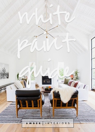
Photo credit: Amber Interiors
if you haven’t seen Amber Lewis’ work I HIGHLY suggest you head over to check out her portfolio after you finish reading this. A self-taught interior designer, she is the ultimate in easy-breezy California cool but also kicks it up a notch on some of her projects, incorporating my dream range (Le Cornue), brass fixtures and unbelievably beautiful patterned tile.
Ok back to the purpose of this blog post! One of Amber’s trademarks is her penchant for white walls (I’m not sure if she actuallly intends for it to be a trademark of her work, but to me, it is. The whites she chooses for her projects are all perfectly matched with every home she designs, but one size does not fit all when it comes to white paint and there are like 40-million different variations of “white”. Now, finally, Amber has decided to bestow upon us a little peek into her styling conscious with her favorite white paint colors from Dunn Edwards and Benjamin Moore (saving for a later share her favorites from the UK-based paint pioneer powerhouse, Farrow & Ball. My favorite Farrow & Ball color is ‘Wevet’).
So without further adieu, here are Amber Lewis of Amber Interior’s “go-to whites”:
BENJAMIN MOORE:
Simply White (OC-117)
“Favorite white right now. I feel like it works almost anywhere and is a true, warm white - great for large rooms with high ceilings.”
White Dove (OC-17)
”This white is a warm, cream white tone with just a hint of grey to tone it down. Light griege.
Decorator’s White (CC-20)
”Bright, clean white - great for ceilings to add height in a space.”
Chantilly Lace (CC-65)
”Cool, crisp white tone with a perfect hint of grey. Not too bright.”
Wedding Veil (2125-70)
“Classic cool white. Easy to read as grey. I usually sample and don’t end up using, but it passes my test!”
Snow White (OC-66)
”Standard white with undertones of grey and green. Pretty in a more modern setting. Reads crisp.”
DUNN EDWARDS:
Whisper (DEW340)
“Light and warm, this white is perfect in a space that doesn’t get much light “
Milk Glass (DEW358)
”The prettiest, warmest white around. I use it all the time to add that perfect warmth in a space. I even used it to contrast trim recently. Pretty!”
White Heat (DEW338)
”This white works best in a brighter space. If there’s not natura light it tends to appear beige, but in the right light, it’s gorg!”
White (DEW380)
”Looking for a clean + bright trim? This is still my go-to. Never fails.”
For examples of these paints in action in some of her projects visit Amber Interiors or her original post here.